Key Takeaways
- A name badge should identify a person within seconds.
- The employee’s name should be the most prominent detail.
- Simple typography, strong contrast, and open spacing improve readability.
- Privacy, comfort, accessibility, and workplace safety should guide badge choices.
- Testing sample badges in real conditions prevents costly design mistakes.
In a busy workplace, a name badge is more than a uniform accessory. It is a small communication tool that helps customers, coworkers, patients, students, and visitors know who they are speaking with. Well-designed Nicebadge custom name badges can support faster, friendlier interactions when the layout keeps the most useful details easy to spot.
Clarity matters most when people are moving quickly, working in noisy spaces, or meeting for the first time. A visitor who can immediately recognize a staff member’s name and department is more likely to ask for help, rather than searching for the right person or interrupting the wrong team.
Why Clarity Matters
A clear badge reduces the friction of everyday introductions. For example, a new employee at a large office can help a visitor find the correct department more confidently when the badge clearly shows both a name and a plain-language role. In contrast, crowded layouts force people to pause, squint, or ask awkward questions, especially under dim lighting or from several feet away.
Build A Simple Information Hierarchy
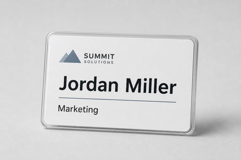
A reader should understand the badge in a predictable order. Put the first or preferred name first, followed by the role, department, or service area. A company or location identifier can come next, while a photo, small icon, office number, or contact detail should remain secondary.
- Make the name the largest and easiest item to scan.
- Use a short, familiar department label instead of internal terminology.
- Limit the front to only the details needed for in-person identification.
- Move minor information to the back when the badge format allows it.
- Do not give a logo more visual weight than the employee’s name.
Choose Readable Fonts And Strong Contrast
Clean sans-serif typefaces are usually the safest choice for names and job titles. Decorative scripts, extremely narrow letters, heavy italics, and all-capital names can become difficult to read at a glance. Dark lettering on a light background is often dependable across different settings, but every design should be checked under indoor lights, outdoor daylight, and glare-prone conditions.
Good spacing is equally important. Leave breathing room between the name, title, logo, and badge edge so each element remains distinct. Federal accessible communication guidance also emphasizes readable formatting, sufficient contrast, and avoiding color as the only way to convey meaning.
Decide Which Names And Roles To Show
Organizations should decide whether a badge needs a first name, full name, preferred name, or first name with an initial. Asking employees what name they use in daily work is respectful and practical. Roles should help the public, so labels such as “Front Desk,” “Nursing,” “Sales,” or “Facilities” are often more useful than internal job codes.
Privacy deserves the same attention. Public-facing employees, school staff, healthcare workers, and teams with elevated contact risks may need less identifying information. A consistent policy can balance approachability with the need to avoid publishing unnecessary personal details.
Plan For Accessibility
Accessibility involves more than selecting a larger font. Consider low vision, color vision differences, glare, distance, movement, and the angle at which a badge is viewed. Never use color alone to identify a department, visitor status, or service level. Pair it with words, symbols, or clear labels, and invite employees with different access needs to review samples.
Badge requirements differ from permanent building-sign requirements, but the principles behind readable signs provide useful reminders about visibility, spacing, and clear identification.
Match The Format To The Work
Clip-on badges, magnetic fasteners, lanyards, and card holders each suit different environments. A front-desk employee may prioritize a polished, stable badge, while a manufacturing worker may need a durable option that stays visible during movement. In areas with machinery or snag hazards, breakaway lanyards or alternative fasteners may be safer.
Placement matters as much as printing. Managers should observe whether badges stay upright, remain visible while employees bend or reach, and work comfortably with uniforms, tools, protective equipment, or outerwear.
Examples For Different Workplaces
- Retail:Use a large first name and a clear service role.
- Healthcare:Prioritize name, professional role, department, and privacy.
- Schools:Make staff, volunteers, visitors, and students easy to distinguish.
- Hotels:Keep names readable from across a desk or lobby.
- Manufacturing:Choose sturdy materials and secure placement.
- Conferences:Use larger names and concise group identifiers.
- Offices:Show a preferred name and simple department label.
Use A Simple Testing Process
- Create two or three uncluttered design options.
- Print each one at its intended size.
- Ask people to read the name from several feet away.
- Test the badge while standing, walking, sitting, and working.
- Check it under multiple lighting conditions.
- Ask employees whether they feel comfortable, visible, and respected.
- Revise based on repeated feedback, not one personal preference.
Avoid Common Design Mistakes
- Oversized logos and undersized employee names.
- Too many colors, borders, icons, and decorative elements.
- Unfamiliar job titles or abbreviations.
- Important text placed near edges or under clips.
- Glossy surfaces that create distracting glare.
- Full personal details displayed without a privacy review.
- Large orders approved without real-world testing.
Common Questions
How Large Should The Name Be?
The right size depends on badge dimensions, expected viewing distance, lighting, and the amount of information included. The name should always be the fastest detail to find.
Should A Badge Include A Job Title?
Include a short role or department when it helps visitors identify who can assist them. Avoid long titles that add clutter without helping the reader.
Are Magnetic Badges Better Than Pin Badges?
Neither is automatically better. Clothing, uniform rules, safety needs, employee preferences, and the work environment should determine the best fastener.
How Often Should Designs Be Reviewed?
Review badges whenever roles, privacy practices, uniforms, visitor processes, or workplace layouts change. A yearly check also helps identify worn materials and outdated labels.
Final Thoughts
The best workplace badge is simple, readable, comfortable, and appropriate for the people wearing it. When organizations treat badge design as part of everyday communication, they can make interactions easier while giving accessibility, privacy, and safety the attention they deserve.