Recognition is strongest when it gives people something lasting to connect with a meaningful moment. A physical coin can preserve the story of a promotion, difficult project, retirement, act of service, or shared milestone long after a congratulatory email has been archived.
For organizations that want a more dimensional award, custom 3d coins can turn an emblem, vehicle, portrait, badge, or mascot into sculpted multi-level relief rather than a flat design. Challenge Coin Country, a Texas-based maker with a team in Spring Branch and more than 15 years of industry experience, specializes in detailed 3D coin concepts, design proofs, plating options, and custom recognition pieces for military, public safety, corporate, and community groups.
Why Physical Recognition Still Feels Different
A coin has presence. It can be held, passed down, displayed on a desk, or carried as a personal reminder of a meaningful contribution. That physical connection gives an award a different kind of staying power than a message on a screen.
The modern tradition has deep roots in shared identity and achievement. The history of challenge coins is closely associated with military culture, but coins are now used by fire departments, law enforcement agencies, schools, nonprofits, sports teams, and businesses. A firefighter might receive one after a difficult rescue, while a team member may receive one for calm leadership during a demanding year. In both cases, the object carries a specific story.
Start With One Clear Purpose
The best design decisions begin before anyone chooses a metal finish or sketches a logo. Write the coin’s purpose in one sentence. For example: “This coin recognizes five years of dependable service to our community.” That sentence becomes a filter for every later choice.
- Outstanding performance or leadership
- Retirement, promotion, or years of service
- Department, unit, or team identity
- Anniversaries, reunions, and community events
- Employee milestones and values-based recognition
- Memorials and commemorative occasions
If the purpose is unclear, the finished coin may still look attractive, but it may not feel personal. A focused idea makes it easier to select the right symbols, wording, and presentation.
Use Shape to Support the Message
A round coin is familiar, durable, and easy to display, but a custom outline can reinforce the reason it exists. A shield may suit a public safety award. A state outline can anchor a regional anniversary. A wrench, aircraft, animal, star, or school mascot can make the connection instantly clear.
Keep Custom Silhouettes Practical
- Choose a shape that remains recognizable at a glance.
- Avoid thin extensions that may weaken the visual balance.
- Make sure it can still be held comfortably and stored easily.
- Use the outline to clarify the message, not simply to add novelty.
Give Important Details More Depth
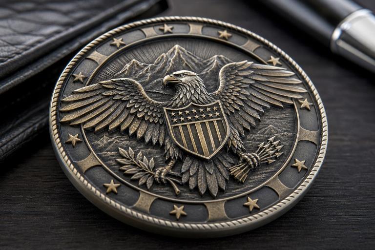
Raised relief and texture help guide the eye. A central eagle, department seal, building, vehicle, or portrait can stand above a recessed field, creating shadow and contrast that people can see and feel. This approach works especially well when one visual element deserves immediate attention.
Depth needs restraint. Keep tiny lettering and delicate lines away from heavily textured areas, since detail can become harder to read at coin size. Reserve the strongest sculpting for the focal point, simplify the background, and review a digital proof at the intended dimensions before approving production.
Choose Finishes That Match the Tone
Finish is not just a decorative choice. It helps set the emotional tone of the award.
- Polished gold, silver, or copper:Bright, formal, and celebratory.
- Antique finishes:Classic and dimensional, especially effective with sculpted relief.
- Dual plating:Useful for separating a featured emblem from its background.
- Black nickel or dark metal:Bold, modern, and well-suited to tactical or high-contrast designs.
- Color accents:Helpful when a school, department, or organization has recognizable colors.
Limit competing finishes and colors. A restrained palette usually makes the main emblem more memorable than a surface crowded with effects.
Build a Story Across Both Sides
Think of the front and back as two parts of the same message. The front can carry the primary identity, such as a badge, crest, title, or symbol. The reverse can explain why the coin matters through a date, location, motto, class number, recipient group, or short statement of appreciation.
For instance, a police academy graduation coin could feature the academy badge on the front, then place the class year, graduation date, and motto on the reverse. Repeating a border style, typeface, or small symbol across both sides keeps the design cohesive without filling every open area with text.
Make the Design Easy to Read
A successful coin works at more than one distance. The central symbol should register immediately, while smaller details should reward someone who looks closer. Awards can carry powerful emotional weight because recipients connect them to achievement, expectations, and the paths that led to the moment, an idea explored in Cornell’s discussion of how people interpret medal outcomes.
- Reduce the concept to its single most important symbol.
- Check whether that symbol remains clear in one color.
- Remove details that will disappear at the final size.
- Review all lettering at actual scale rather than on an enlarged screen.
- Ask someone outside the project to explain what they see first.
Plan the Presentation, Not Just the Object
The presentation gives the coin its origin story. Decide who will present it, whether the moment should be public or private, and what will be said. A short explanation is enough: identify the recipient’s contribution, name the value it reflects, and explain why it matters to the group.
When appropriate, include the coin in event photographs, displays, or a team tradition. Keep a simple record of the design, date, recipient group, and reason for recognition. That record helps preserve meaning for future members and makes anniversary programs easier to build.
A Practical Design Checklist
- Is the purpose clear in one sentence?
- Does the main symbol connect directly to the achievement or group?
- Can every important word be read at the final size?
- Does the shape strengthen the message?
- Are depth and texture focused on the right element?
- Do plating and colors match the intended tone?
- Does the reverse add meaning instead of clutter?
- Has someone outside the project reviewed the proof?
- Is there enough time for design approval and production?
- Will recipients understand why they received the coin?
Common Design Mistakes to Avoid
Common problems include placing too many symbols on a small surface, using long sentences where a short phrase would be stronger, hiding lettering in texture, copying a generic design, and approving artwork too late. Avoid ordering a large quantity without detailed proof, and do not treat the coin like an ordinary giveaway. Recognition works best when the design, the occasion, and the message all point to the same value.
Conclusion
The most memorable recognition coins do more than display a logo. They combine a clear purpose, readable artwork, intentional shape, useful texture, and a presentation people remember. When every choice supports the same story, a small coin becomes a lasting reminder of what the recipient did and why it mattered.